Similarweb Subscription Page Redesign
Project Type
End-to-end product design project for Similarweb core platform
My Role
Product Designer
Timeline
3 months
Contribution
User research
Stakeholder interview
Project management
High-fidelity prototype
Tools
Figma
Mixpanel
Similarweb, a platform created to deliver the most accurate, comprehensive, and actionable digital data to businesses around the globe, needed a revamp of its admin subscription page. The existing page was unstructured, confusing to users, and led to little engagement. Recognizing its potential value, I was tasked with a user-centric redesign of this page. This case study dives into the transformation, showcasing how the new Subscription Page equips admins with valuable information in a way that encourages them to upsell.
As the Product Design intern, I joined Similarweb’s cross-platform team as their designer. From user research and ideation to prototyping and final delivery, I collaborated with the team, which consisted of the Product Manager, UX writer, and developers, to drive a complete transformation of this page.
Project Goals
To equip admins with valuable information about their subscription and their package in a way that will incentivize them to upsell.
To increase page visits, upsell and conversion rates, and reduce churn.
To me, it wasn’t enough to just see that Similarweb’s existing subscription page was visually outdated. In order to understand and validate the pain points as much as possible, I conducted user interviews and competitive research, in addition to analyzing data.
DEFINING THE PROBLEM
Research Questions
What are the desired outcomes when admins are on the subscription page?
What obstacles does the user encounter that makes it difficult for them to accomplish their goals?
What is the most important information on this page and what information should be highlighted?
What information is missing on the subscription page?
A Look at
the Data
The primary user of this page is the account admin, who has administrative responsibilities including assigning user seats and accessing subscription details. Interviews revealed that Account Managers frequently receive requests from admins for tasks that these admins are already capable of performing themselves. Additionally, data indicated that this page has low usage and minimal engagement.
7,500
Admins
2
Average Monthly Visits
20%
Unique Visits
1.33%
Click on contact buttons
Taken together, this research yielded several crucial insights and informed key design requirements.
Key Insights
“Sometimes features are grouped together in a contract but then show up separately on the subscription page, making the admin think they are paying extra for built-in features. The goal of this page should be for admins to be able to understand a breakdown of exactly what they are paying for.”
- Sarah, Account Manager
1. Lack of structure
The existing design is a long list that is difficult to digest and does not align with how our company talks about pricing and packaging.
“The subscription page can be a great way to incentivize customers to upsell and present them with features that could be relevant, however there is currently no call to action and limited chances for handraises.”
- Lotem, Product Manager
2. Limited outreach
This page has an opportunity to address business goals and lead to upsell, but the design is lacking the incentivization that encourages admins to purchase add-ons or upgrade their subscription.
Design
Requirements
Structured Layout - Implement a structured and organized layout that makes the information easy to digest
Clear Breakdown - Provide a clear understanding of the costs for admins by separating and distinctly displaying the base package inclusions and purchased add-ons
Highlight Relevant Features - Emphasize the most valuable and frequently requested segments, such as country filters and historical data
Refine Taxonomy - The feature names presented on this page are taken from the claim (technical back office item), which is internal lingo that is confusing for the user
Feature Descriptions - Enhance user understanding of existing and new features by including more details
Incorporate Call-to-Actions - Make the page more interactive to allow for organic opportunities for the admins to purchase add-ons or upgrade their subscription
DESIGNING THE SOLUTION
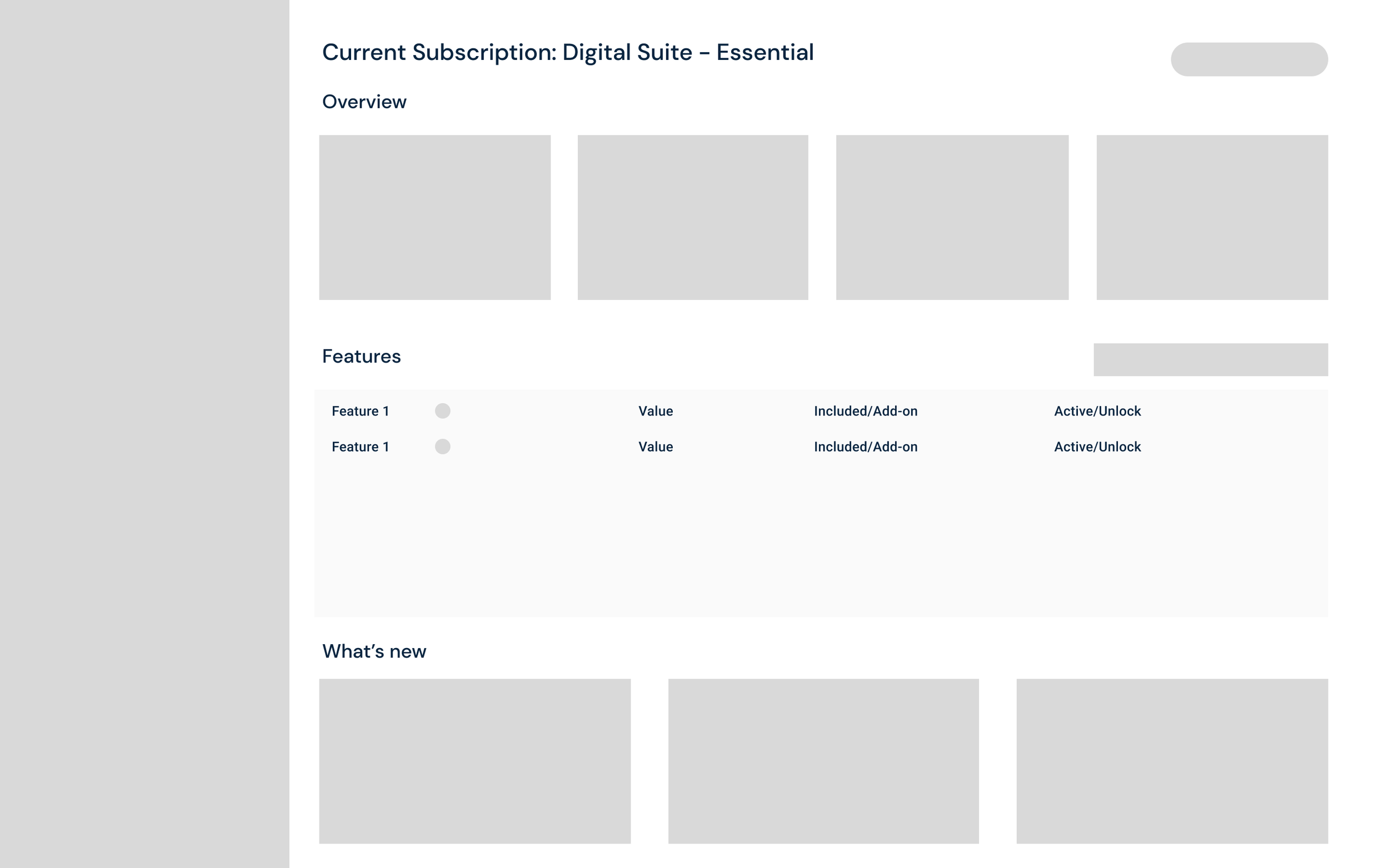
Initial wireframes focused on restructuring the information architecture to address the pain points in a way that was intuitive and maintained consistency with the Similarweb platform.
Wireframes
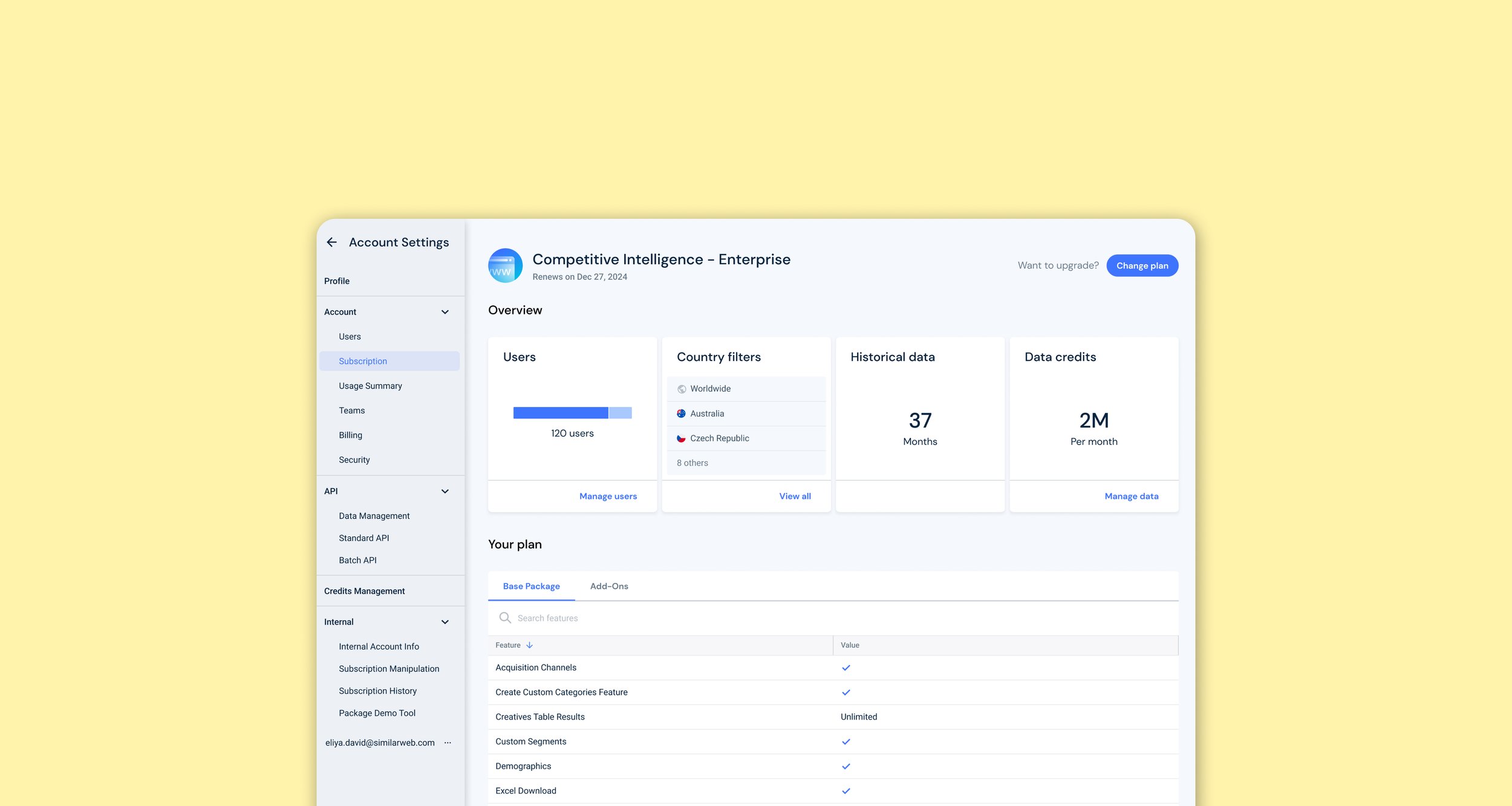
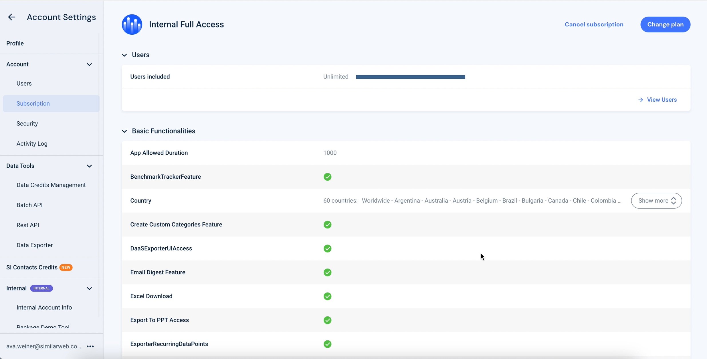
With wireframes in place, the next step was to bring them to life. Through multiple iterations of high-fidelity designs, I arrived at a visually appealing solution that addressed the requirements and leveraged Similarweb’s existing design system components and brand elements.
High-Fidelity Prototype

Edge Cases
For a feature such as country filters, which varies a lot between customers, I had to design for a range of use cases. From looking at data, we saw that a majority of users (54%) have 1 country filter, while 15% have more than 5 country filters. Keeping this in mind, the design of the overview cards went through several iterations in order to look the best for as many scenarios as possible.

Ultimately, the solution was a table and a pop-up. The collapsed view of the card has a maximum of 4 rows to align with the sizing of the other cards. If the user has more than 4 country filters, the View All button leads to an expanded view to display the full list of country filters.

DISCOVERING THE IMPACT
Limitations & Challenges
There were changes we were unable to implement at this initial stage due to technical limitations that we understood from meeting with developers.
Taxonomy & Tooltips: Initially, the goal was to rename the features and add a tooltip with a description of the item to make it clearer. However, since there are over 7,000 individual claims, this required a heavy lift that was not in the scope of this project.
Features to Try: The purpose of the “features to try” section that is seen in the wireframes would be to display add-ons that the user does not currently have access to in order to encourage even more upsell opportunities. Ultimately, this became a challenge because it is highly specific to each customer and would require being fed from another source that does not currently exist.
Measuring the Results
Before the end of my internship with Similarweb, I collaborated with the developers to bring this new solution to life. The redesigned subscription page aims to address user pain points and drive positive business outcomes. Here's a snapshot of the metrics the team is using to assess the impact over time:
Increased use of the subscription page
Increased handraises via contact us forms and upgrade CTAs
Existing Design
New Solution
Design Improvements:
Structured Layout - Implemented a structured and organized layout that groups the information in a straightforward way
Clear Breakdown - The table
of features directly separates base package inclusions and purchased add-onsHighlight Relevant Features - The overview section emphasizes the most
important segmentsIncorporate Call-to-Actions - Created more opportunities for users to reach out and take action from this page